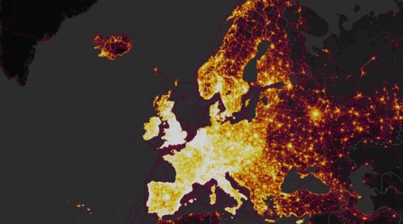
City planners stand to benefit from Strava’s heatmaps, now carrying six times the detail
Strava’s heatmaps have been turbo charged, providing six times the detail over the firm’s original 2015 data. The enhancement further hands city planners a wealth of data on which to plan cycling infrastructure in minute detail.
Back in May of 2016, Strava outlined in an interview with CI.N how its data-collection was proving fruitful for urban planners, highlighting the most commonly chosen commuter arteries and the shortcuts taken where infrastructure is perhaps deemed inadequate.
Launching the updated heatmaps, Strava today flags over 1 billion activities, many of which stem from Strava’s Metro program, the functionality that flags specifically leisure and commuter rides. Within the app riders can mark their journey this way and the firm says that the athlete to everyday cyclist ratio is tipping. Featuring in the current data, 5% of the land on Earth has been cycled, equating to a total distance of 27 billion kilometers.
City planner, Jorge G. Coelho, from AMAL in Portugal said: “The Strava Heatmap is enlightening because it lets us connect the bike riders we spot on the streets with a broader perspective of our territory, over space and time. Strava Metro then gives us the possibility to dive much deeper, breaking down data minute-by-minute and segment-by-segment for the entire road network. It’s a bit like our Pasteis de Belém: they’re good to smell, but you have to really sink your teeth into them to fully take advantage.”
To view the global heatmap in all its glory, head here.


